Excel – it just does not scale. For years I’ve watched investigators work with large datasets using Excel, and have done so myself. For years, I’ve also developed tools to support working with this type of data in a more user friendly, less error prone manner. Yet the other day I watched someone share an Excel spreadsheet full of incomprehensible numbers while saying “And this shows ….”. If you built the spreadsheet and/or are intimately familiar with the data this is a workable approach. For anyone new to the data there is a steep learning curve to get to the most basic insights. And even then, it does not scale.
We are human, we need visual data, and quickly. Once you gain the initial insights then diving into the details probably has value but not before.
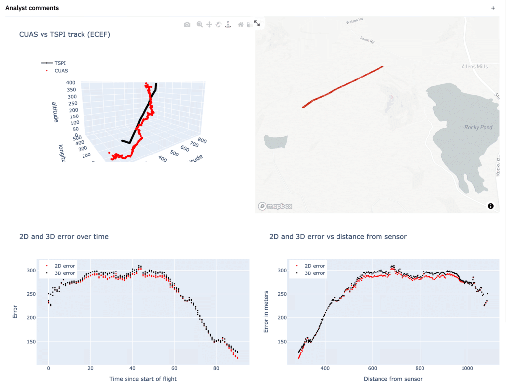
So, let’s go back to the image I shared at the outset.
Evaluating CUAS Accuracy
In one page the user can quickly see:
- Roughly how close the CUAS track was to the TSPI track
- Where the flight occurred, which provides useful context
- How well the CUAS tracked the target over time
- How well the CUAS tracked the target vs the distance from the target to the sensor
With appropriate systems in place, these visuals can be produced in or near real time, and certainly very quickly after validating the data post-event. Used appropriately, evaluators and vendors can adjust the test environment in response to questions raised during the event rather than weeks or months later. Further, these visuals were produced using an open API which means that investigators can choose their own visualization and analysis tools – MATLAB, Python, R, etc.
Appropriate near real time visualization capability should dramatically improve test and evaluation effectiveness while also supporting deep dive analysis post-event.
(These were produced using URSA’s telemetry analysis platform for normalization and storage and Python for rapid user interface prototyping.)